Sunday, November 8, 2009

More on the Book.

Here's the second-last spread for my book:


Now there's only one illustration left to be done.

Thursday, November 5, 2009

Buy This Book.

Seriously. If you're into acrylics, this one will floor you. It's hardcore.

Tuesday, November 3, 2009

The Key to It All.

Hey kids, I'm been playing with video again. Here's another layer-by-layer video, this time with music I threw together in Garageband:

Evidently I still need to learn some things about format, but bear with me. Soon you'll think I'm an award-winning movie director and shower me with riches.

Friday, October 30, 2009

Hot Rods and Bulletholes.

Okay, this is something new for me - I'm no Luddite, but when it comes to video I'm waaay behind the curve. Anyhow, with a little advice from my friend Das, I figured out how to record video as I activated the various layers in a Photoshop file.

I wanted to give readers a sense of how some of my illustrations are put together, so this shows the layers being added, one by one from the bottom up:


Note that the video just features a small section of the piece. Here's the whole thing, for reference:


And yes, this one will be in my book, too.

Saturday, October 24, 2009

An Update on the Book.

Hey folks, just a quick update - as of yesterday I've got 28 of the projected 30 illustrations done for the pin-up book. This has been a much more lengthy process than originally intended, but the final product oughta be worth the wait. And it's definitely been a good experience for me - not exactly a huge sacrifice to spend a year drawing women, after all.

Anyhow, I've got the final two pictures planned out (the last one will be a tattoo design), so hopefully I can get this thing off the ground before Christmas, and then everybody can buy a copy and I can retire to the French Riviera and drink champagne and eat caviar all day.

Oh, and here's the one I finished yesterday:


Cheers,
Bret.

Tuesday, October 20, 2009

Mopar Madness.

Hey, folks. Been tweaking and updating a lot of my older art the past few days. Here's a couple I dug out of the archives from 2001 and 2002. In both cases the colour scheme in the top part of the image was the original, and the one in the bottom part is something new.

Anybody got a preference?


I suspect I'll spin off more variations as well. I'd really like to see flames on that Dart.

Thursday, October 15, 2009

howyadoin graphics

Well, the big day has finally arrived: I found a place online to sell prints of my art.

I've only got a few pieces up yet, but needless to say, there'll soon be lots more. Check it out here, if you're so inclined.

Sunday, May 31, 2009

Crow's Funeral.

A little something I whipped up for the CD release party for my good friends in Mojave:


Crow's Funeral, of course, is the name of their new album. It's based on a phenomena documented here. The band put out a call for art and photography based on the title, and the result is the closest thing I've done to sequential art in years.

Anyhow, I thought I'd show a couple of process shots with this one - I had a lot of fun dribbling and spattering paint all over it for weeks. The first image shows the underpainting, and the second has three macro shots taken while the drops of paint were still wet:


And finally, here's a closeup of the middle panel:


It's always a pleasure to work on something so loose and organic - all that broken colour is a blast.

Friday, March 6, 2009

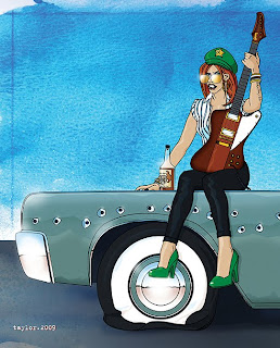
Girls, Girls, Girls.

Well. It's been a long time.

I've been sadly neglecting this poor blog over the past few months. But fear not - there's still been a lot of art happening. In a development that I didn't see coming at all, I've fallen in love with illustration again.

I just wanted to get back to doing more drawing, because after two years of focusing on acrylics, it felt like my drawing skills were getting a little rusty. For every painting that I'd spend hours and hours on, there would generally only be 15-20 minutes of drawing at the beginning, if that.

So, armed with my trusty pencils and a sketchpad, I started off by redesigning Supergirl:


I wanted to make her more down-to-earth, and I wanted to bypass all the near-kiddie-porn aspects of her current comics, so a more normal physique, hair and glasses were the key.

After that I realized how much I'd missed combining analog and digital illustration, so I plunged right into another one:


A little marker illustration, a little photography, a little bourbon and a lot of Photoshop. Good times, good times.

At this point I started poking through my reference material and my unfinished-projects files. This girl in the parka was an idea for a painting that I had last summer, but apparently it got shelved in favour of some other project:


Around this point I got the idea of putting a bunch of these together in a book. There're lots of print-on-demand options these days, so my plan now is to do 20-30 of these pieces for publication. I'm aiming for late spring/early summer. Hopefully I haven't bitten off more than I can chew.

A couple more recent pieces that I want to put in the book:


The Viking woman is a reworking of an old illustration from 3 years ago. Initially I planned to just tweak a few details, but I ended up re-inking the whole thing, keeping the basic face and helmet, changing the hair, adding the fur and the chain and the sword, rotating the composition, ditching all the colour fills, and adding the red and orange colour holds. That may sound like a lot of work, but the whole thing didn't take more than an hour or so.

So there we have it. Lots more drawing for me to do if I'm gonna pull this off.

Wish me luck.

Thursday, December 4, 2008

A Little Experiment.

Hey, it's high time for another installment. This time I'm here to talk about interference and iridescent paints. I've been using both for awhile now (which is to say, a whopping two years), but it never occurred to me to try mixing them with other colours.

Then after a chance remark from an artist friend of mine, I went looking around Golden's website and read an interesting tip about mixing interference colours with a small amount of black, to get a deeper, richer mix. (For the uninitiated, interference colours change between a bright opalescent color and a more subtle complementary colour, depending on the
viewing angle. There's a fairly complex mathematical explanation involving the polyatomic interference that results from the meeting of two wavetrains of white light, but for our purposes here, let's just say that the paint contains shiny particles of mica.)

Anyhow, armed with this seemingly minor tip, I got out the paints and tried mixing a few combinations of interference colours and Mars black on the back of a scrap piece of illustration board. Some of them looked great, and others were less than satisfying. But since I was already in laboratory mode, I started adding other paints to the interference colours - some opaque, some transparent. From there things led pretty naturally to iridescents (highly-reflective paints with metallic additives - mica, iron oxide, titanium, etc.).

Before I knew it, I'd come up with a whole slew of options and was practically cackling like a madman. Then I tried photog
raphing the results, which was a challenge in itself. After several tries, I finally came up with these two photos:


Here's a list of the combinations depicted in the photos:

A - interference green + mars black
B - interference orange + mars black
C - interference orange + pyrrole orange
D - interference blue + mars black
E - interference blue + cerulean blue
F - interference blue + phthalo blue
G - interference green + phthalo green
H - interference violet + mars black
I - iridescent pearl + alizarin crimson
J - interference blue + cobalt blue
K - interference blue + phthalo green
L - interference orange + iridescent bright gold (fine)
M - iridescent bright gold (fine) + sepia
N - iridescent bright gold (fine) + pyrrole orange
O - interference blue + dioxazine purple
P - iridescent stainless steel (coarse) + alizarin crimson
Q - iridescent bright gold (fine) + arylide yellow (deep)

This, of course, gives me enough ideas to explore for months. Give it a try yourself and you'll see what I mean.