So hey, I'm still plugging away on the hot rod book. Learning all kinds of things - some trivial, some not. One of the most fun things about a new piece is deciding on the colour. It's amazing the kind of resources that are out there on the net these days. Yesterday I started on a picture of a 1960 Chevy Impala Brookwood station wagon, and put the word out in a few places (
Facebook,
Twitter, etc.) that I was looking for colour suggestions. In the space of an hour I had about a dozen suggestions, and dammit, they were all good. I'm still undecided, to the point where I may actually do 4 versions of the car.
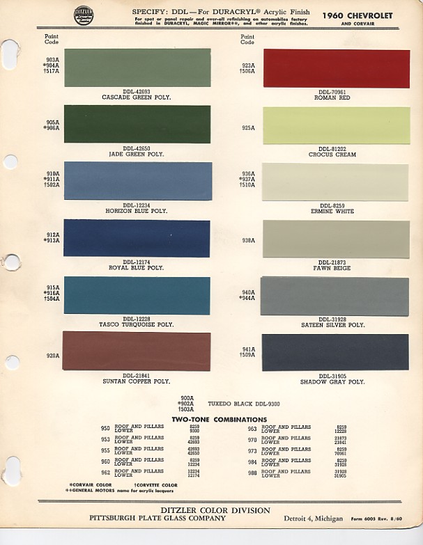
But I digress - I was talking about the resources you can find online, wasn't I? Well, one of the responses was a scan of the paint-chip chart for 1960 Impalas. You can find it
here if you're interested. Stuff like this is a goldmine to me. I think from here on in, I'll make an extra effort to source this kind of reference material whenever I draw a vintage car.
So, back to the Brookwood wagon. I wanted a two-tone paintjob, and a couple of non-stock colour combos came to mind. Then when I saw that chart, I saw several other viable options. (Even as I type this, more come to mind. Maybe I need to stop looking at it now.)
I finally narrowed it down to 5 options yesterday, and then managed to weed out one more. Without further ado:
That's option 1 - what I call the Creamsicle Combo. Cream and orange pearl.
Option 2 is based on factory colours - Jade Green and Cascade Green. I may render them to look like metalflake, though.
Option 3 is Pagan Gold and Candy Root Beer. From what I'm reading in the car magazines these days, that brown is one of the trendiest colours around in that scene. Though I must admit, I never thought I'd draw a brown car.
Option 4 is, like option 2, based on the factory colours (in this case, Royal Blue and Horizon Blue). And again, will probably be done in metalflake.
Obviously these are all still in the extremely rough stages, but what you see here should get the point across. And the more I look at these, the more I like all of them. This car would probably look good in just about any colour, really.
Anyhow, if you've got feedback, I'd love to hear it. Other suggestions would be fine, too. Maybe I could do a poster with a whole slew of Brookwoods on it.
Thanks for reading.
Bret


